How to choose a wallpaper style that still lets you read your phone
A wallpaper is the one picture you look at more than any other, but you never see it alone. On the lock screen the clock and notifications sit on top of it. On the home screen, rows of icons and their labels do. A style you love can still make your phone harder to read. This guide shows you how to pick one that works with both.
Quick style selector
Start from what you want the screen to feel like, then check the picks below for how each one reads.
| If you want… | Try | Browse |
|---|---|---|
| Nothing competing with the clock or icons | Dark or minimal, with little detail | AMOLED and dark, Minimal |
| A scene to look at when you pick up the phone | Nature or anime, with the detail kept low | Nature, Anime |
| Colour and energy | Abstract or vibrant, best on the lock screen | Abstract |
| One picture for both screens | Dark, low detail, subject kept low | AMOLED and dark, iPhone |
Where the clock and icons land
Two parts of the screen matter most. The top third is where the lock-screen clock and date usually sit. The middle and bottom hold the home-screen icon grid and, on many phones, a dock row along the bottom edge. A wallpaper reads well when the area under the text is either calm or clearly darker or lighter than the text.
The images in this guide were made for Flux with that in mind. The generation brief recorded for each one in the app's catalog asks for a “clean upper third for lock-screen clock”. A brief is not a result, though, so we measured each preview instead.
Seven picks and how they read
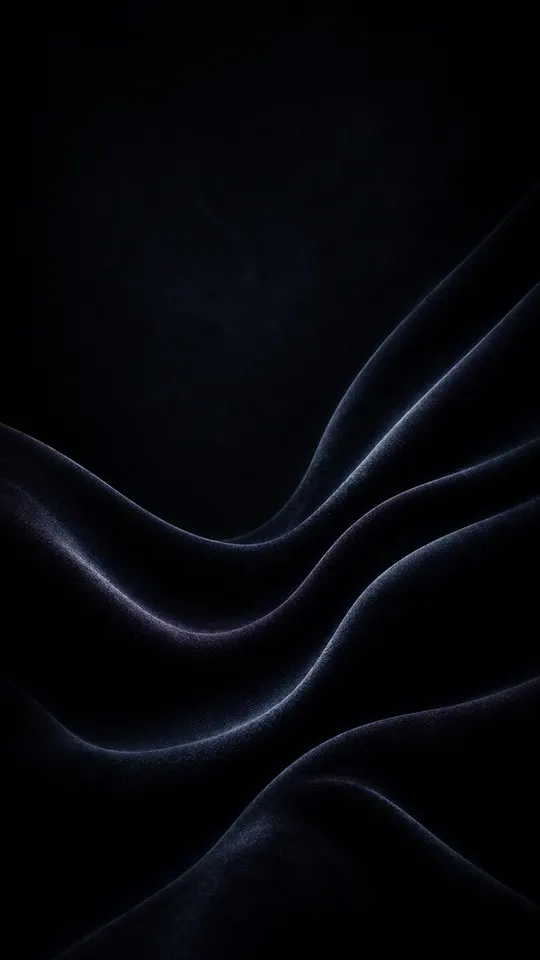
Velvet Dune Swells
Dark · both screens · AMOLED and dark
The top third has an average brightness of 5 and almost no detail, the darkest of these picks and among the quietest. A white clock and white icon labels get the strongest contrast this side of pure black. The folds through the middle are low-contrast, so they add texture without crowding icons. This is the safest choice if you want the same picture on both screens. More like it are in AMOLED and dark wallpapers.
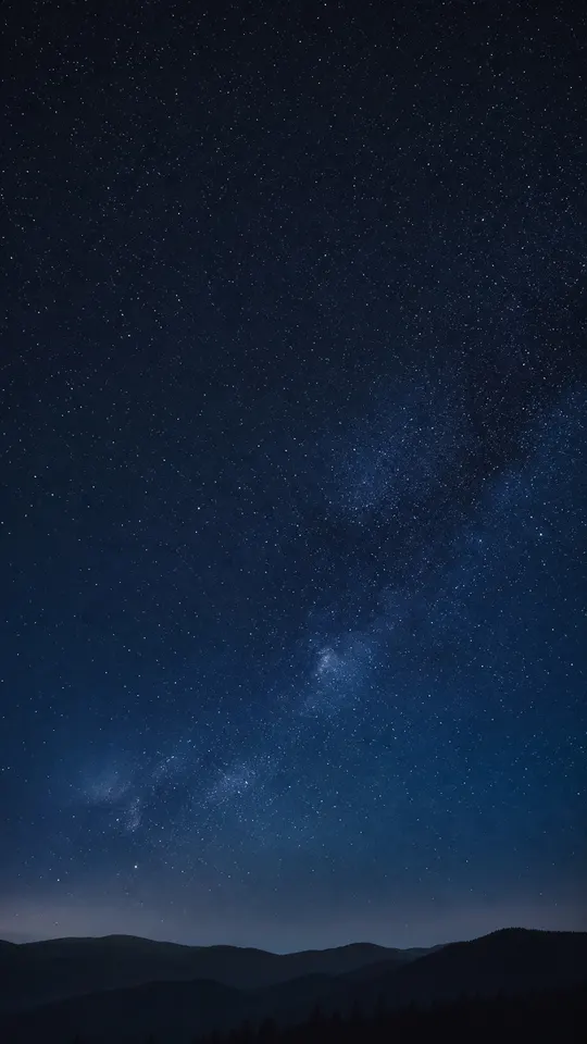
Milky Way Ridge
Nature at night · both screens · iPhone
A scene that still behaves like a dark wallpaper. The sky above the clock averages 22, with the stars as fine points of detail rather than shapes. The ridge sits in the bottom fifth as a smooth silhouette, which is where a dock goes, so nothing busy sits behind your most-used apps. If you want nature without giving up a crisp clock, start here.
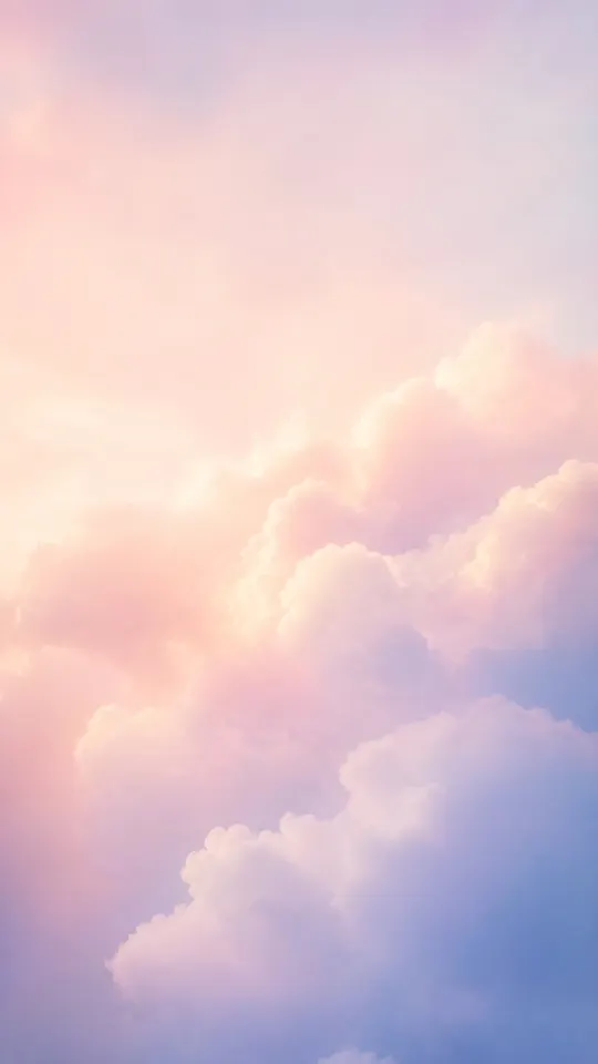
Peach Cumulus Dusk
Soft · both screens, with care · Minimal
The calmest light wallpaper here. Detail stays near zero in every band, so nothing fights with text. The catch is brightness: the top third averages 217. White text on a background that bright has little contrast, so if your clock and labels are white, check it on your own phone before committing. On iPhone you can change how the time is displayed when you edit the Lock Screen, Apple notes. Browse Minimal wallpapers for more light, quiet picks.
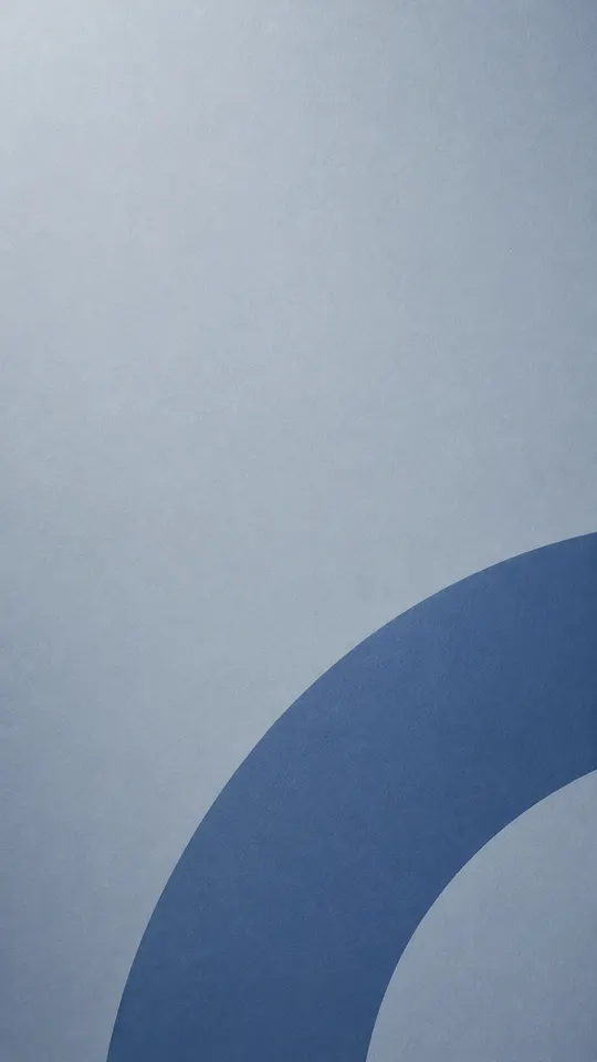
Blue Ring Segment
Minimal · both screens · Minimal, iPhone
A single big shape, placed low and off-centre, on a plain field (detail 0.3 to 0.7 in every band). Large shapes are easy on icons, because labels never land on fine detail. The top is a mid-light grey (179), so like any mid-tone background it suits neither white nor black text as strongly as a dark or very light one would.
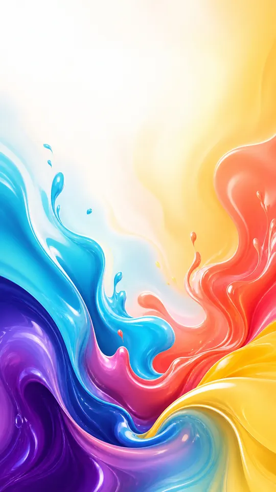
Glossy Paint Splash
Vibrant · lock screen · Abstract
Colour is the point here, and it runs through the middle and bottom (detail 3.6 and 3.9), right where icons and the dock sit. On a home screen that much movement makes labels harder to pick out. On the lock screen, with little on top of it, it shines. Note the top third averages 244, nearly white, so a white clock would almost vanish. Pair it with a darker clock style or a calmer home screen. More colour lives in Abstract wallpapers.
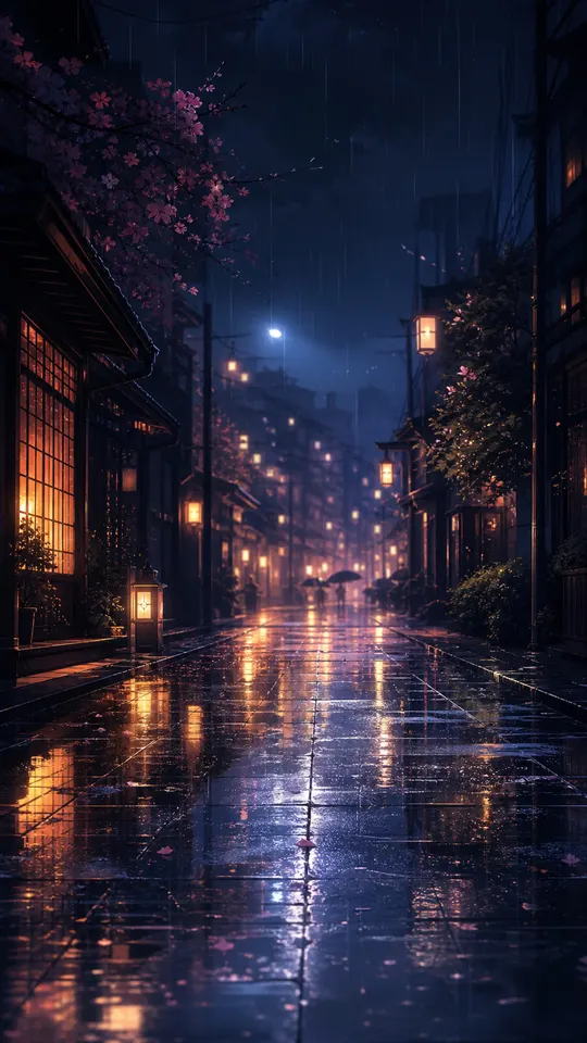
Rainy Lantern Lane
Anime · lock screen · Anime
A detailed scene: the middle band scores 8.7 for detail, the busiest of these picks. The top is dark (23), so a white clock reads fine, and the lock screen is where this belongs. Behind a full grid of icons, the lanterns and reflections compete with every label. If you want it on both screens anyway, iPhone lets you customize the Home Screen and “select Blur to blur the wallpaper so the apps stand out”, in Apple's words. See the Anime wallpapers for more scenes.
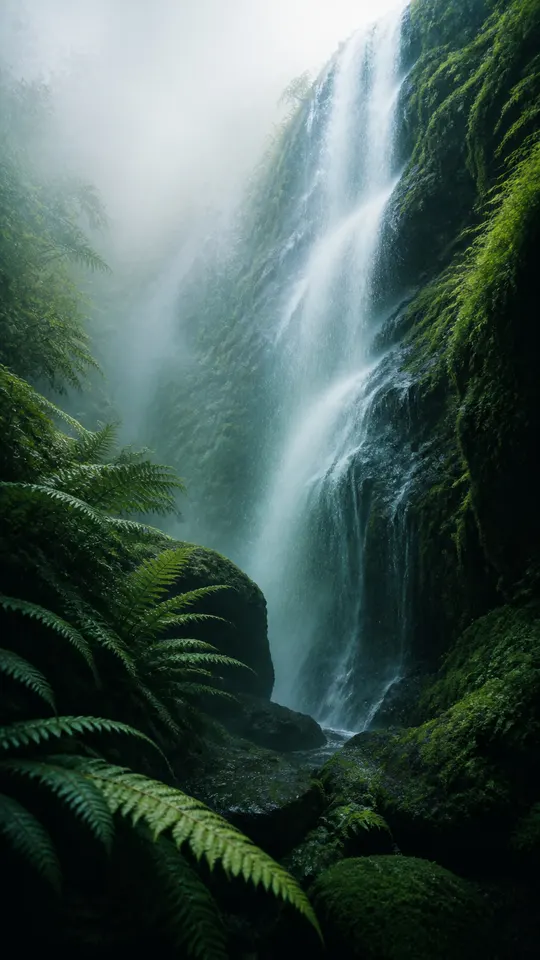
Fern Mist Waterfall
Nature · check before use · lesson in measuring
This one teaches the most. Its brief asked for a “clean misty upper third”, but the bright spray of the waterfall lands right there. Its top third scores 3.7 for detail, the highest of any pick here, and its brightness swings widely around an average of 157. It is a lovely picture. It is not a clock-friendly one. Judge the top of the actual image, not its description. For calmer nature, browse Nature wallpapers.
Three rules of thumb
- Keep the top third calm if you read the time on your lock screen. Flat sky, dark space or soft gradients all work.
- Keep detail away from the icon grid on the home screen. Big shapes and soft textures are fine. Fine, high-contrast detail is what makes labels hard to read.
- Use two wallpapers when one can't do both jobs. A busy favourite on the lock screen and a quiet one on the home screen is often better than a compromise. iPhone, Pixel and Samsung Galaxy phones all let you set them separately (steps in the fitting guide).
How browsing works on this site
Every wallpaper here belongs to a style collection. Start at all collections, open one, then open any wallpaper for a larger preview. The previews are 540 × 960 and 1080 × 1920 images, and your browser loads the size that suits your screen. They are previews, not the originals: the originals of the wallpapers on this site are 2160 × 3840 in the Flux catalog. To get a wallpaper onto your phone, use the store buttons below to install Flux. Our guide to wallpaper resolution explains the difference, and the guide to fitting a wallpaper covers setting it up without bad crops.